Dark mode implemented
This document introduces the steps to implement dark mode functionality in the Next.js Starter Kit.
Prerequisites
The following environment is assumed for this implementation.
- Next.js - Page Router 14.2.18
- Sitecore JSS 22.3.1
- Tailwind CSS 4.0.0
Enabling Dark Mode
-
Install the
next-themespackageTerminal window npm install next-themes -
Add
ThemeProvidertosrc/pages/_app.tsx. The code below is partially excerpted.src/pages/_app.tsx import { GoogleTagManager } from '@next/third-parties/google';import Bootstrap from 'src/Bootstrap';import { ThemeProvider } from 'next-themes';function App({ Component, pageProps }: AppProps<SitecorePageProps>): JSX.Element {const { dictionary, ...rest } = pageProps;return (<><Bootstrap {...pageProps} /><GoogleTagManager gtmId={process.env.NEXT_PUBLIC_GOOGLE_TAG_MANAGER || ''} /><I18nProvider lngDict={dictionary} locale={pageProps.locale}><ThemeProvider><Component {...rest} /></ThemeProvider></I18nProvider></>);} -
Add dark mode settings to
tailwind.config.js.tailwind.config.js /** @type {import('tailwindcss').Config} */module.exports = {darkMode: ['class'],content: [],
Once the above settings are complete, you can see that the display changes depending on the mode of the PC when you refer to the page. For example, on a PC screen using light mode, it is displayed in light mode as shown below, and the mode is described in data-theme in HTML.
<html lang="en" data-theme="light" style="color-scheme: light;"> ...</html>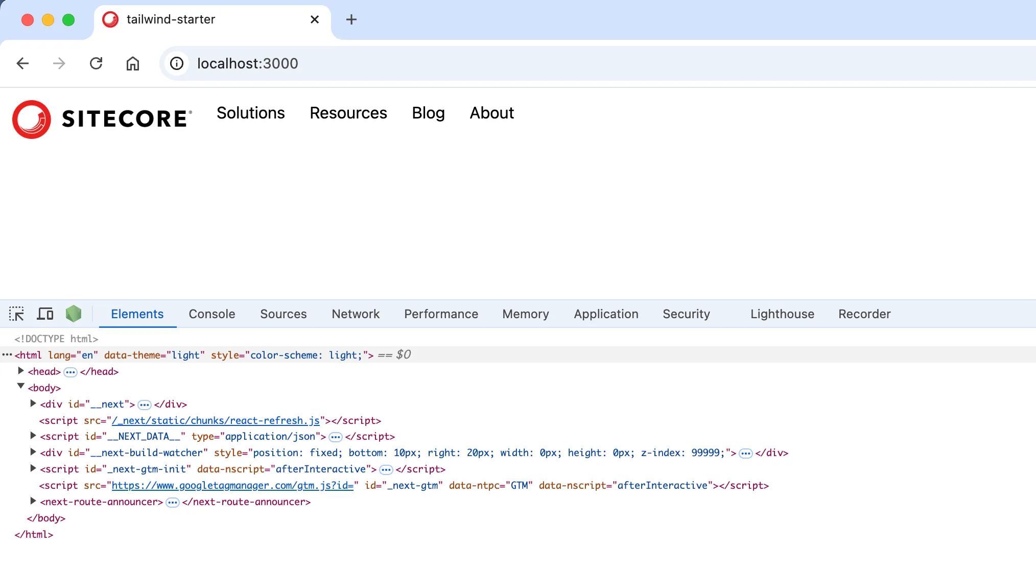
In dark mode, it switches to the following code.
<html lang="en" data-theme="dark" style="color-scheme: dark;"> ...</html>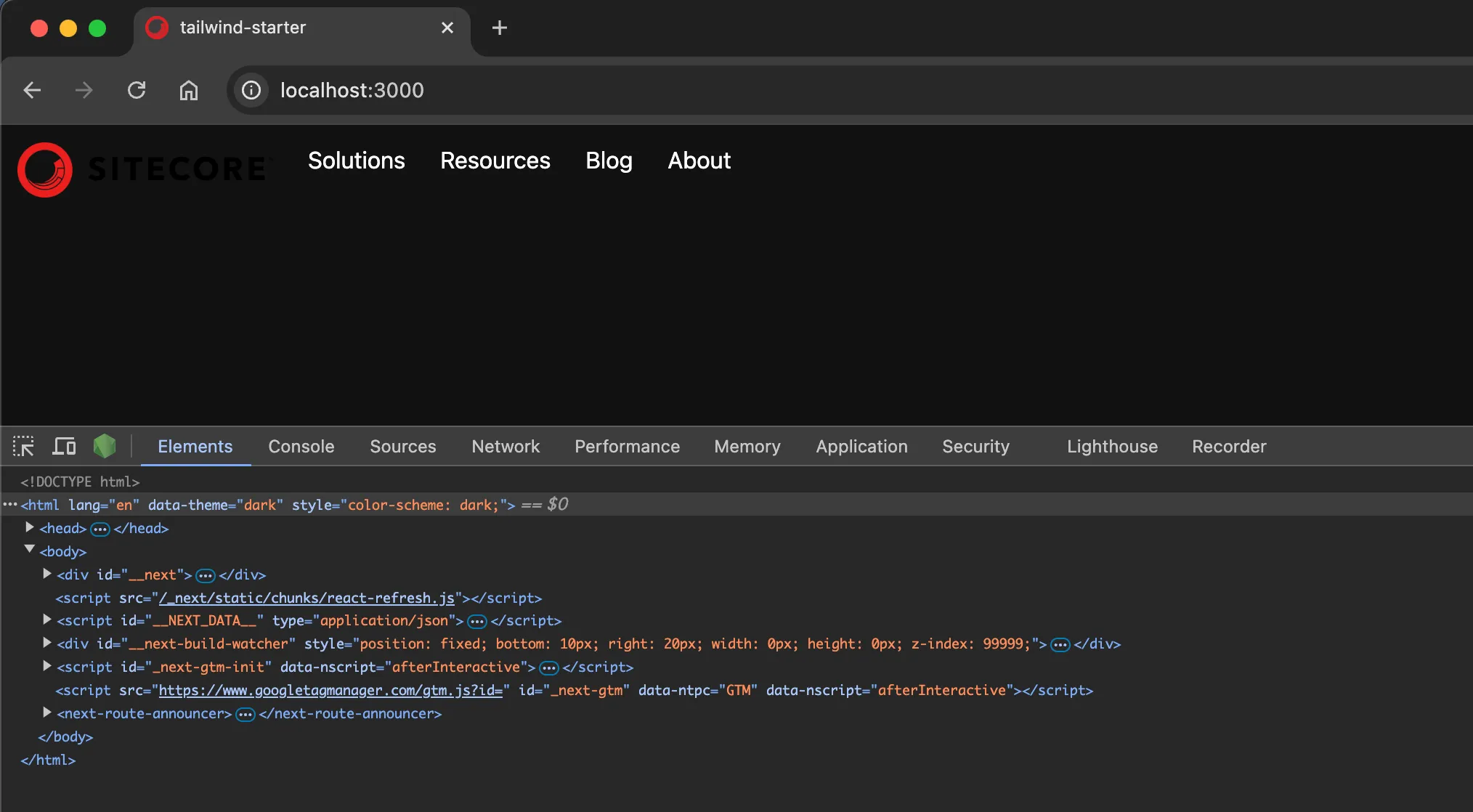
Implementing the Toggle Button
Dark mode is now enabled according to the PC mode, but to add a toggle button to switch modes according to user preference, you need to add a mode switch component and implement it on the page.
Adding the ThemeSwitcher Rendering Item
The component to be created this time will only switch the display of the screen, so it will be created as a component that does not require a data source. The creation of the component is introduced in another article, so if you have not referred to it yet, please take a look.
Proceed with the preparation to add the component according to the following steps.
-
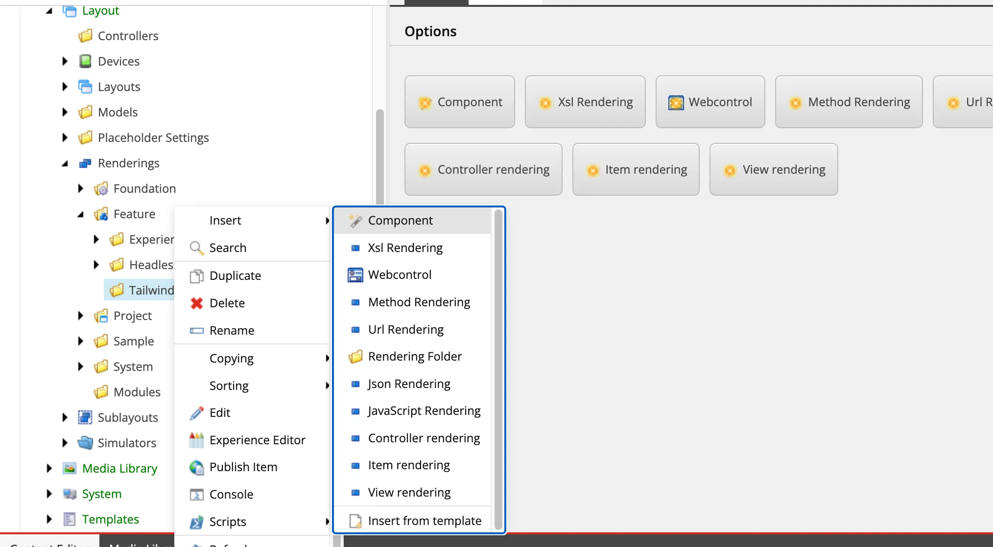
This time, create the following path and create the component.
Directorysitecore
Directorylayout
DirectoryRenderings
DirectoryFeature
DirectoryTailwind/
- …
-
Right-click to launch the Component Wizard
-
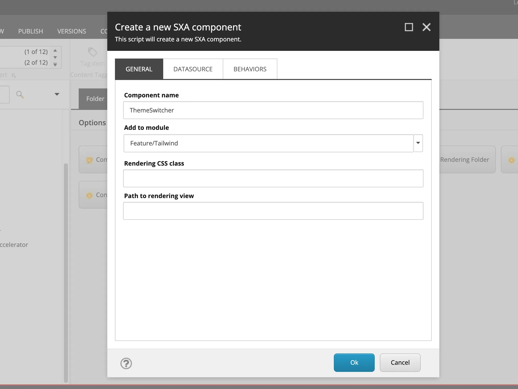
Set the name of the Component to ThemeSwitcher.
-
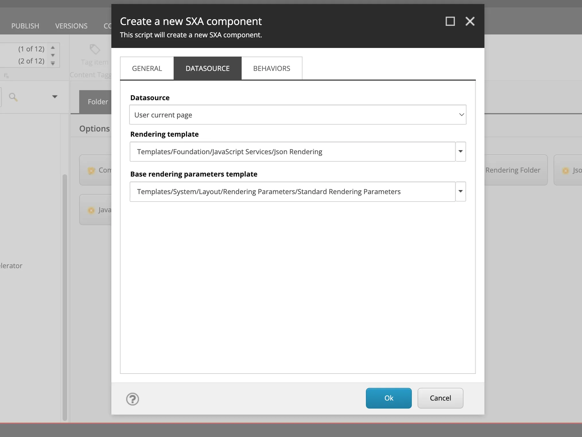
Open the Datasource tab and set the following two items.
- Datasource: User current page
- Rendering template: Templates/Foundation/JavaScript Services/Json Rendering
-
Change the icon of the created rendering item. Select Configure - Icon and specify
office/32x32/moon_half.pngas the icon. -
Select Home - Display name and change the display name to
Theme Switcher.
Now the component is ready.
Creating the Component File
You need to add the code used by the created component to the project. Here, execute the JSS command to create the file.
jss scaffold ThemeSwitcherWhen you run the above command, the src/components/ThemeSwitcher.tsx file is created, and the code is as follows.
import React from 'react';import { ComponentParams, ComponentRendering } from '@sitecore-jss/sitecore-jss-nextjs';
interface ThemeSwitcherProps {  rendering: ComponentRendering & { params: ComponentParams };  params: ComponentParams;}
export const Default = (props: ThemeSwitcherProps): JSX.Element => {  const id = props.params.RenderingIdentifier;
  return (    <div className={`component ${props.params.styles}`} id={id ? id : undefined}>      <div className="component-content">        <p>ThemeSwitcher Component</p>      </div>    </div>  );};
Placing the Component
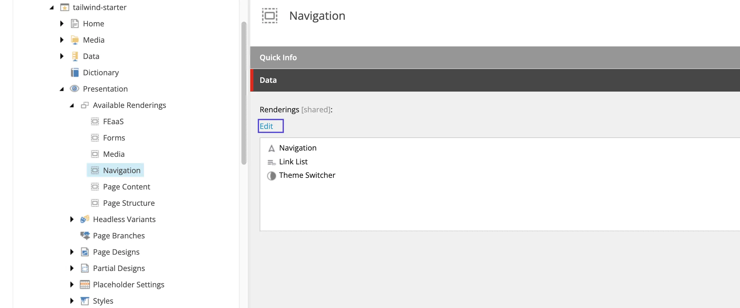
The rendering item and code of the component are ready. First, add it to the Rendering available for use on the target site so that it can be used on Pages. This time, it was added to Navigation.
Launch Page Builder and confirm that it is displayed in the list of components.
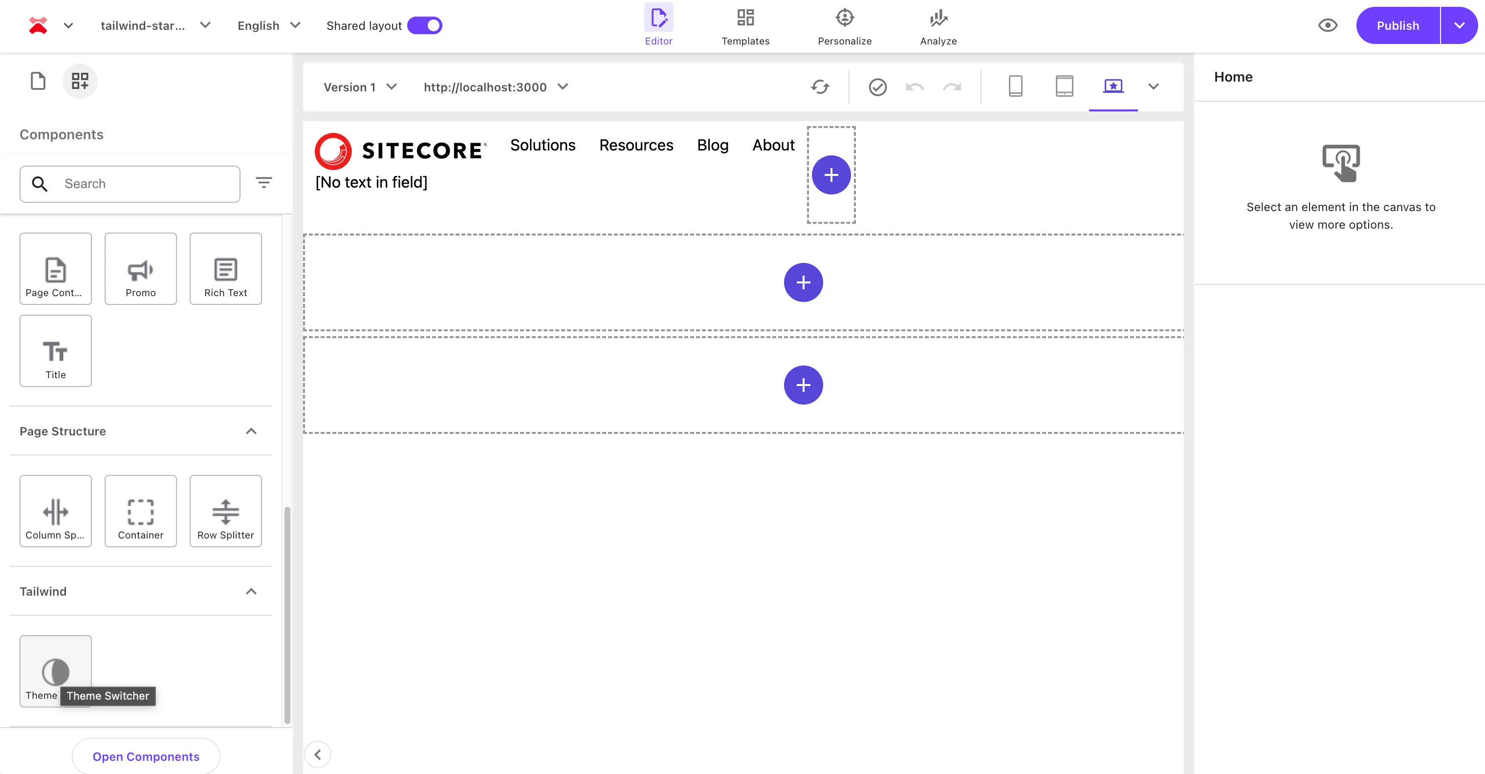
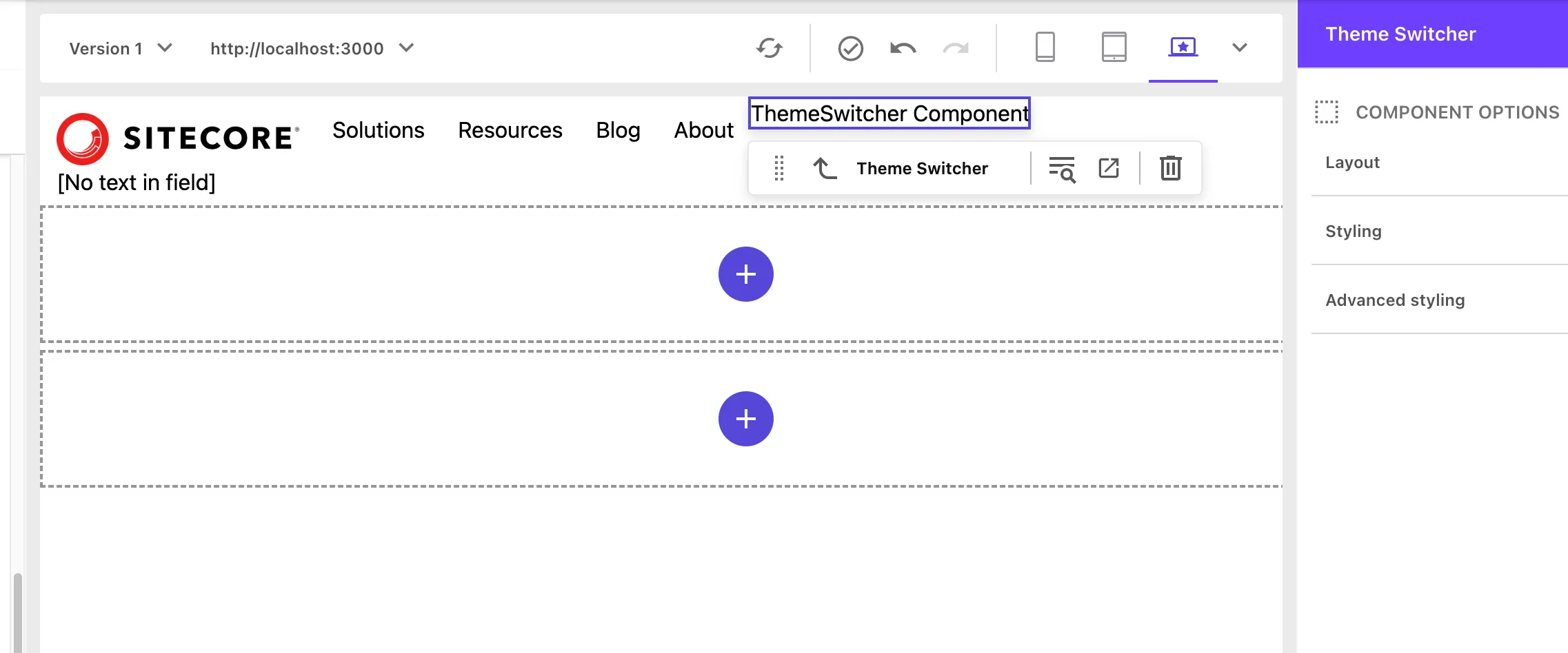
When actually placed, you can see that the component name prepared in the sample code is displayed.
Rewriting the Component Code
Change the current component code to code for switching modes. This component will work without using data from Sitecore, so change it to the standard dark mode code as follows.
import { useTheme } from 'next-themes';import React, { useEffect } from 'react';
export const Default = (): JSX.Element => {  const { theme, setTheme } = useTheme();
  useEffect(() => {}, [theme]);
  return (    <div>      <button onClick={() => setTheme('light')} disabled={theme === 'light'}>        Light      </button>      <span> - </span>      <button onClick={() => setTheme('dark')} disabled={theme === 'dark'}>        Dark      </button>      <span> - </span>      <button onClick={() => setTheme('system')} disabled={theme === 'system'}>        System      </button>    </div>  );};
After rewriting the code, when you check the display on the new page, you can see that the mode switches as shown below.
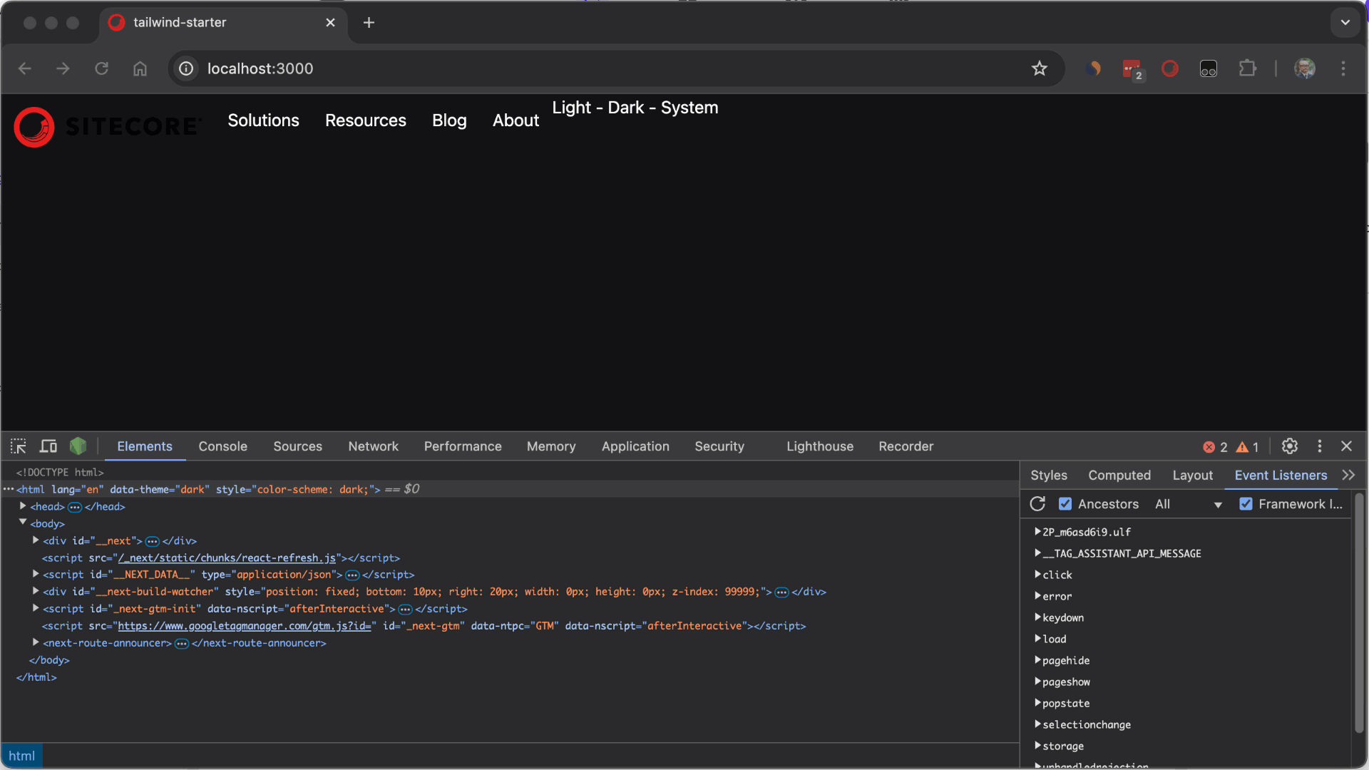
You can now switch between dark mode and light mode.
Summary
This time, we introduced the implementation of standard dark mode. As for how to create this component, it is a simple component that does not use Sitecore’s data source, so it was confirmed that it can be set in the same way as general Next.js implementation.